Concept: Complementation
- complementation between the old and new
~authentic, traditional recipe and the habit of not wasting (uses newspaper to wrap otak-otak) VS modern frozen food technology and fast and convenient service
~ eg. common media on unusual canvas, western illustrative styles in Chinese design
1. Watercolour

- watercolour on newspaper: using the media on an unusual canvas
2. silkscreen/stamping
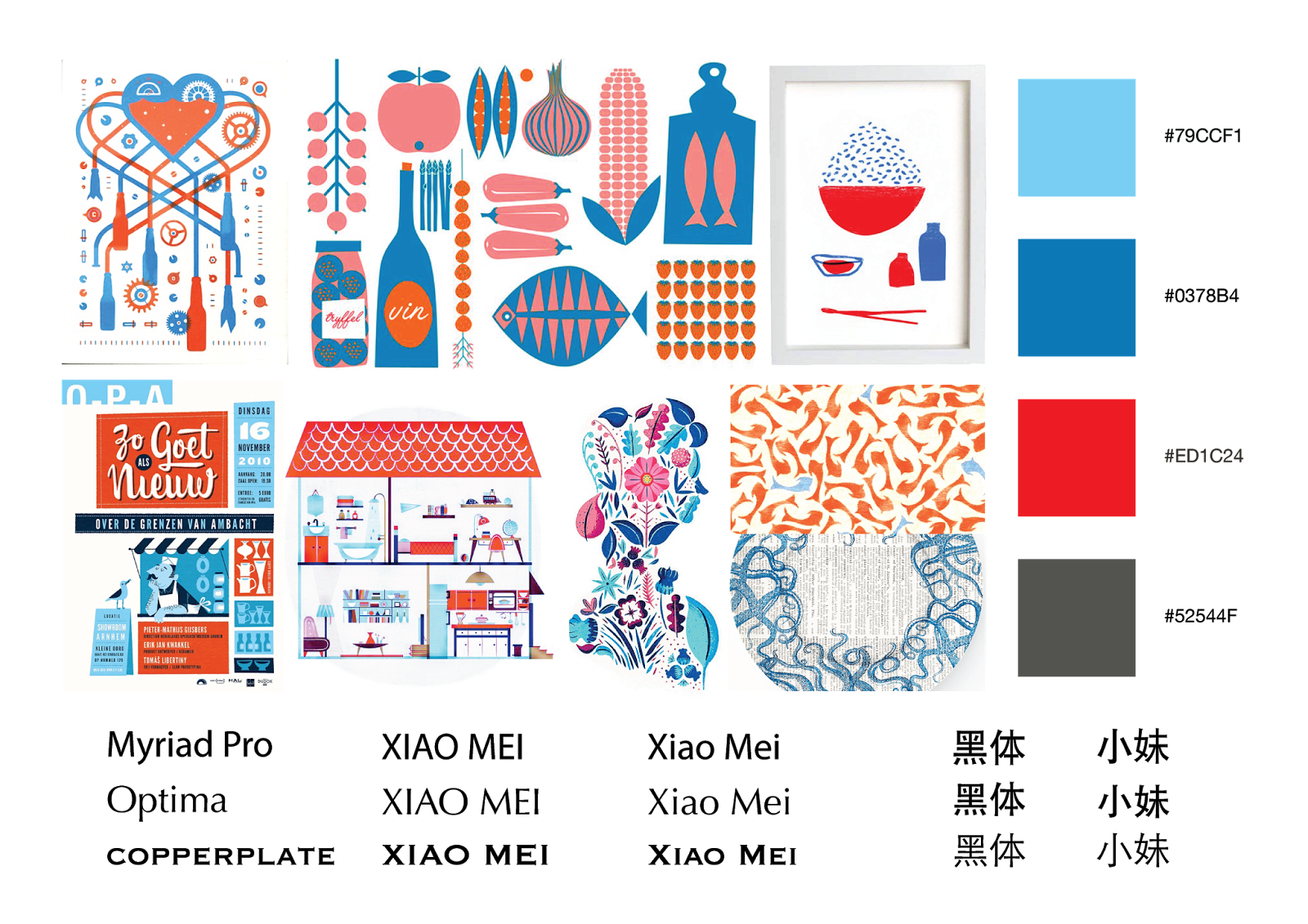
- stamping on newspaper
- fast and convenient
- pattern: a school of blue fish VS red Xiao Mei logo
- blue: sea, red: colour of otak-otak
3. doodle

- eco feel
4. geometrical-minimalist vector

- cute and simple
5. colour pencil and watercolour

_________________________________________________________________________________________________
Feedback:
- No.1: too contemporary
- No. 3: too much attitude, a style not commonly liked/preferred
- No.4: so so, No. 5: Malay feel
~ has potential
~ to explore on tones of red and blue to make the general appearance more approachable
~ font: Futura? to explore more fonts
~ playing with patterns on silhouettes
~ to explore possible items for logo/pattern application: wrapper, items in store
~ suggestion: print on other paper, eg. paper for food (more hygienic) rather than newspaper: 1 side with pattern, 1 side for DIY recipe
No comments:
Post a Comment