Sunday 29 June 2014

Business Card Layout (Attempt 1)

Just a tryout on various business card layouts with the temporary logo


_________________________________________________________________________________________________

Feedback:
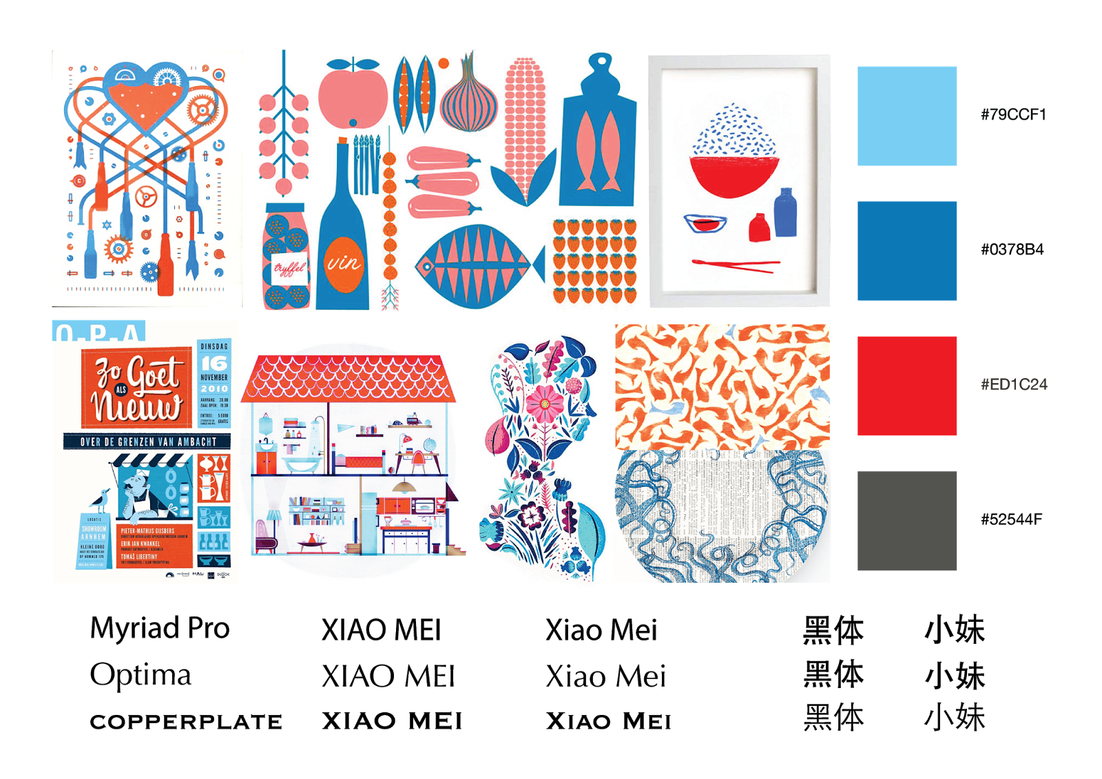
- confusion: which is the person? Xiao Mei or Cheah Hui Ting?
- logo + chinese and english brand name can be placed at the decorative side, while other information can be at the opposite side (logo included as a sign of continuation)
- Xiao Mei and 小妹: choose one to emphasise
- hierarchy issue: to group into boxes
- flush left, ragged right: avoid extremely long lines in a sudden
- diagonal design similar to swiss design, slightly old fashion nowadays
- to explore different business card shapes

Thursday 26 June 2014

Logo Idea Generation and Sketches (2)

Logo design with constructive grids


_________________________________________________________________________________________________
Feedback:


- blue are the better ones
- to consider: hidden 'M' as a crown or a more modern square space
- without angulation is more stable and modern
- to alter angle and thickness if to do angulation
- to explore with colours on the sub triangles


Saturday 21 June 2014

Research on Corporate Identity and Stationary (1)

Observations...

1. Apart from stationary, CI is also applied to business related items

2. Everything looks like a family: same colour palette, texture/pattern applied systematically 
    - not completely the same on all items, but has a sense of wholeness/uniformity


Friday 20 June 2014

Logo Idea Generation and Sketches (1)

Inspirations...

1. Chinese seal


2. MAA logo


    - 'M' shape similar to crab


Sketches


    - 'XM': Xiao Mei
    - 'X' appears via negative space while 'M' also appears as a form of a crab
    - the form of 'XM' is like a fish
      >> Xiao Mei, visually recognised as a crab previously, is a brand which produces authentic Muar Otak-otak with fresh mackerel 


_________________________________________________________________________________________________

Feedback:
- to construct logo with construction grids
- to re-design 小妹
- to explore logo with different blue-red tones

Thursday 19 June 2014

Moodboard (Attempt 2)

Following the previous feedback, I redo my moodboards, focusing mainly on different illustration styles.

Concept: Complementation
- complementation between the old and new
  ~authentic, traditional recipe and the habit of not wasting (uses newspaper to wrap otak-otak) VS modern frozen food technology and fast and convenient service
  ~ eg. common media on unusual canvas, western illustrative styles in Chinese design

1. Watercolour 
    

    - watercolour on newspaper: using the media on an unusual canvas


2. silkscreen/stamping


    - stamping on newspaper 
    - fast and convenient
    - pattern: a school of blue fish VS red Xiao Mei logo
    - blue: sea, red: colour of otak-otak


3. doodle


    - eco feel


4. geometrical-minimalist vector 


    - cute and simple


5. colour pencil and watercolour


_________________________________________________________________________________________________

Feedback:
- No.1: too contemporary
- No. 3: too much attitude, a style not commonly liked/preferred
- No.4: so so, No. 5: Malay feel

- No. 2
  ~ has potential
  ~ to explore on tones of red and blue to make the general appearance more approachable
  ~ font: Futura? to explore more fonts
  ~ playing with patterns on silhouettes 
  ~ to explore possible items for logo/pattern application: wrapper, items in store
  ~ suggestion: print on other paper, eg. paper for food (more hygienic) rather than newspaper: 1 side with pattern, 1 side for DIY recipe


Thursday 12 June 2014

Moodboard (Attempt 1)

Concept: traditional

1. Chinese ink painting


2. Chinese paper cutting and traditional window frame


3. Photography


4. Traditional packaging method


5. Cute illustration with retro colour palette 


_________________________________________________________________________________________________

Feedback:
- No. 1 and 2: too Chinese, may not be appealing to the general target audience
- No. 3: too common
- No. 4: cannot stand as one art direction
- No. 5: has potential as illustration is more approachable to existing and new target audiences

- bad typo choice

- suggested concept: complementation
  ~ between various cultures
  ~ between ingredients

-  to redo moodboard based on new concept

Wednesday 11 June 2014

Business Card Inspirations

Business cards that people remember...

1. Being fun/interactive or have something related to the business itself
    - most of the time requires some kind of manipulation (fold, peel, pull, tear, poke...)


2. Being functional
    - serves other purposes rather than just an ordinary name card (business related)


3. Unusual material


** some brainstorming on how can I apply what I've found for my Xiao Mei Otak-otak business card...
    - business related
      ~ showcase the process of making otal-otak behind the card


    - unusual material
      ~ atap/banana leaf: leather stamp??
         (embossing on leaf-textured paper should be easier and more practical...)

    - functional

      ~ print on a washing sponge (otak-otak colour): too far fetched?


Tuesday 10 June 2014

Research on Logos (2)

Original Xiao Mei logo


- 3 elements: crab, Xiao Mei and 小妹
- which to keep and which to abandon?
  ~ crab: important, as humans are mostly visually oriented
  ~ Xiao Mei: crucial for non-Mandarine readers to identify the brand, especially when the crab image is modified/simplified
  ~ 小妹: the identity of a Chinese brand
     >> all three should be included in the new design


Research on similar logos
1. Logo designs with Chinese elements


    - most Chinese characters are redesigned rather than using available typeface
    - either extremely geometrical or has a sense of continuity


2. Crab logo designs


    - varies from extremely complicated to extremely simple
    - but all remained or even exaggerated the crab's distinctive feature: the pincers

Monday 9 June 2014

Research on Logos (1)

Based on research, I realised that the elements of a successful logo are:
1. simple
2. make use of negative space
3. portrays the image/essence of the business/company
4. catchy/grabs attention
5. special (not common)

Only typography


Picture and typography


Sunday 8 June 2014

Concepts and Directions

1. Traditional


    - authentic traditional Muar otak-otak recipe
    - emphasises original ingredients and taste
    - traditional enough to secure existing customers, yet modern enough to attract new, younger people 

    - telling the story/process of making otak-otak (line art, vector art, narration)

    - chinese paper cutting, wood carving
    - traditional packaging using banana/atap leaf and strings to hold boxes of otak-otak together
    

2. Healthy


    - emphasises healthy, original ingredients
    - encourage home cooking and easy DIY
    
    - showcase actual product
    - natural mood and lighting
    - clean and simple


3. Eco-friendly


    - environmental friendly product
    - emphasises on effective packaging: minimal material, eco material, functional, minimal ink usage packaging

    - banana, atap leaf
    - fibers used to tie Chinese dumplings 
    - craft paper, recyclable food friendly paper

    - not really a concept, but can combine with others 


4. Cool and convenient


    - it is cool to cook yourself and it is even better if it is easy/convenient to prepare
    - no special cooking skills required, simple as 1, 2, 3

    - simple geometrical vector art
    - showcase the product boldly
    - typography based: emphasises 'simple as 1, 2, 3'


_____________________________________________________________________________

Feedback:
- traditional seems to work better
- to work on logo and front panel

Saturday 7 June 2014

Xiao Mei Otak-otak Creative Brief (Draft 1)

Background
- 20++ years old family business selling frozen otak-otak in Muar
- mission: to deliver quality, authentic Muar Otak-otak

- products: otak-otak (mackerel fish, lala, cuttlefish, crab, prawn, fish head, fragment fish), fish roll otak, fish otak nugget
- current market: some at Muar, mostly sent to Yong Peng, delivers to other parts of the Peninsula on demand (at least more than 10), has a distributor in Singapore (Savory Delights)

- problems:
 ~ competition ++: more than 30 manufacturers and distributors

 ~ packaging lack of identity: similar to other brands, very ‘china’ look
 ~ little interaction in Facebook page

Objective
To enhance existing identity
-  a younger image but still preserving originality and tradition

Target Audience

- existing customers: tourists (Singaporeans and people passing by Yong Peng), housewives

- potential customers: young adults (20-35 years old: college students staying away from home, single, health conscious working adults who prefer easy-to-prepare home cooked meals)
Consumer Insights
- tourists/people passing Yong Peng purchase otak-otak based on reviews and word of mouth
- young adults feel that they will buy frozen otak-otak because it is convenient to prepare, have many DIY options but have problems remembering the exact brand because visually most brands look the same


Competitors
- direct: A Class, Octhavia, Octhaco, Daily Happy 
~ varies from having better logo, packaging, website, promotional strategies, display corner/shop ambient and overall image and identity
- indirect: frozen food products like Ayamas, Farm's Best, Marina Frozen Foods, First Pride
~ more product choices, available at most supermarkets


Product/ Brand Positioning

Xiao Mei Otak-otak has the biggest amount of visible fish chunks in it.

Strategy Statement
Convince people aged 20 to 35 years old that Xiao Mei is the authentic Muar otak-otak because it contains big chunks of fresh mackerel fish meat in its mouth watering traditional recipe.

S.M.P.
Mouthful bitable chunks in Xiao Mei

Support

1. Convenient and easy to prepare
2. No preservatives
3. Quality recognised (halal, ISO, HACCP)
4. Many DIY methods
5. Delicious traditional recipe

Tone of Voice
Young, fun, positive

Mandatories
Facebook page address, logo

Budget
Minimal to medium

Where to Sell
Internet, major supermarket outlets

Promotion
- existing: buy 10 get 1 free
- DIY recipe together with packaging
- tourist gift pack
- freebies, eg. bread...
- collaborate with kopitiams
- prepackaged otak-otak meal (eg. with rice, bread..)

Media
Internet, packaging

** Future Trends
young adults as target consumers, to focus on easy to prepare, time saving, healthy  portable, single portion, user-friendly, microwaveable packaged food/ready meals, internet retailing (maybe?)


Xiao Mei Otak-otak


Existing brands